Monday, December 6, 2010
What we learned..at 8 am.
In this course, I have learned a whole bunch about many things that I had no clue how to even start them. :) This class was very interesting, I really enjoyed learning the things that we did and how to do the projects. I really appreciate the new found skills that I have gained, learning about InDesign and Illustrator, I also liked using Photoshop and the layering in my poster project. I enjoyed trying to recreate the feel of my graphics with my inspiration graphics. When we used the Graphics Tablets, I had so much fun just doodling on that. So much so that I plan on getting one very soon for my own personal use. Overall from where I was when I came into this class, I have improved in my computer skills greatly (seeing how I had just had my first experience with a Mac the semester before). I think that it helped that I had to help somebody else with some of their computer things,which helped me in the long run.
Friday, November 12, 2010
Pirates!
Okay so I've chosen to pick the How to be a pirate as my Zine. I've found a couple of images and have done some sketches. There were a couple of background images that I thought were interesting and some inspiration for the ship & the look of the pirate. I was thinking about a grisly old pirate captain explaining how to be a pirate, and having someone that he can change throughout the zine to make into a pirate.


Wednesday, November 10, 2010
"How to..." Zine
So this final project of the semester is about making a "How to..." Zine. Basically a short magazine. I am currently go back & forth over a couple of subjects to choose from. I had originally wanted to do How to crochet a granny square, but I had seen that somebody else had wanted to do that idea as well...great minds think alike I guess. So then I am mulling over How to be a Pirate or How to bottle-feed a calf. The Pirate idea would have the illustrations being mostly hand drawn and then scanned into the computer. Ideas for the pirates would have several examples on how to be a pirate. But the Calf idea would be mostly made up of pictures, showing the process of making a bottle and then properly feeding it. So those are the two I am trying to choose from.
Tuesday, November 2, 2010

Wednesday, October 27, 2010
InfoGraphics
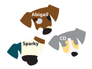
So for this project we had to think of a way to properly display two types of information in a visually communicating way. One of the information types has to be from a personal experience. So I chose to do information over the life span of my dogs based on the color of their coat (fur) and several other factors as well. These are a couple of examples of what some of the visuals might look like, these are just some of the starting stages of the puppies, this visual kind of hits two birds with one stone by including both the name of the dog and the coloring/markings on the dog.
Wednesday, October 20, 2010


Thursday, October 14, 2010
Illustrations that I am interested in..
These are found Illustrations not my own, but I thought they were cool so I put them in an album. Most of them I found on Google and deviantART but you can view them at this link : http://picasaweb.google.com/110639223724313855236/FoundIllustrations#
Monday, October 11, 2010

Tuesday, October 5, 2010
Assignment #3
This assignment we are making a public service poster about something we care about. I chose to do a poster about planting 2 trees for every one that we cut down to help keep some of the forested areas that are disappearing fast. Trees are an important part of life and they should be kept around as long as possible.
Here are some references that I used to help with this project.
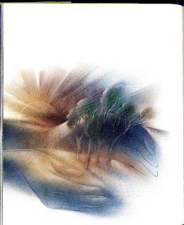
This was scanned from a children's book that was in the school Library. I am using the texture that is used for the graphics in the picture.
Here are some references that I used to help with this project.

This was scanned from a children's book that was in the school Library. I am using the texture that is used for the graphics in the picture.
Friday, September 24, 2010

Sunday, September 19, 2010
Letter Photos :)
This is the link to my Picasa account which has my letters in an album there. http://picasaweb.google.com/110639223724313855236/DigitalPortfolio?feat=directlink
Saturday, September 18, 2010
Assignment 2
So this assignment we are supposed to take a font and use the letters of our name to create a replica of the letter exactly in/out of different objects. So the font that I chose was Eurostyle Bold, it has a clean lined look to it & no serifs. After picking the font we needed different ideas and to take photos of those ideas in place. So the different ideas I had for the letters were..
K- Matches, a large letter with matches for the actual letter all jumbled on the "line" or stroke of the letter. With the match box placed off to the side slightly spilling out.
a- Beads/beaded necklace, using the beads or a beaded necklace create the outline of the a from a short distance from more necklaces or beads, shoot photo at an interesting angle
i- Batteries, take a pack of batteries and use the batteries in one line to create the i. Take photo at an angle.
t- Crayons, using the crayons place them to where the point is facing towards the ceiling, place one crayon at a time to create the look of the t (you could place a rubber band at the bottom of the first couple to create a "wall" to have the other crayons lean against as long as you cant see the rubber band). Place these on a coloring page halfway colored with the coloring book shown in the picture as off to the side or below the coloring page the crayons are on.
l- Post-it notes, use the post-it notes to create an l shape and place them on a notebook with books all around like being interrupted at studying.
i- Carmel candies, use the candies still in their wrappers and create an i on a band or concert t-shirt
n- Paint, using paint to create the letter place some used paint brushes and other props nearby.
S- Colored pencils/shavings of colored pencils, cut out the inside of a letter S, use colored pencils and a handheld pencil sharpener, sharpen the colored pencils and put them on the cut out part. When all is covered, pull up the letter very carefully and the shavings should be put into the shape of the letter S. Take a picture with all the pencils you sharpened in the photo, lined up at the edge with the sharp points pointing at the letter. Take photo at an angle.
w- Glue, cut out the interior part of the letter w, place the outline on a smooth surface to where it won't stick, or on wax paper and put the glue inside the space you cut out. Let it dry (you might want to set it under a light or blow dry the letter to make this a faster process) when dry peal up the letter and cut it away from the paper you used as a stencil then place the letter on a cute picture of a dog. Take a photo, play with the way the letter is positioned on the page to create an interesting photo.
e- Toast, using a piece of lightly toasted bread cut out an e in the middle, place the toast outline on top of other pieces of bread on a plate next to some peanut butter (or regular butter). Take photo.
i- Straw(drinking straw), use a clear drinking straw and very carefully cut the letter out of the side of the straw, only one side though! Then take a picture with the straw in front of a light.
t- Confetti, cut out letter and using the confetti (either bought or homemade) make an outline of the letter leaving the inside of the letter to be blank (negative space) place the confetti thickly around the edges of the letter & the further you get away from the edge start to lesson the amount/the thickness of the confetti leaving spaces in between the confetti, looking like it spilled & then the letter is just taken away from the middle. Take photo.
z- Duct Tape, using tape make the letter z look like it is holding something that has broken apart & the tape is the only thing left holding it together. Take picture.
e- Floating object, using an object that floats cut out an e & put it floating in the bath tub or sink. Take photo.
r-Wax, in either a candle or a wax warmer (has a light bulb) trace the letter r on the surface of the wax, use a metal paper clip and shave away the interior of the letter in the wax. the surface will probably be rough so use a match or a lighter and melt away the rough parts of the letter, take the picture in an interesting way, with either the wax warmer on or the candle lit.
Friday, August 27, 2010
Assignment 1: 2 Stories
So this is the process that I went through to get from the two stories we were supposed to convey with images to what we will then use to create Logos.


This was the first image: I fed a baby calf this summer so I wanted to convey that.

Then this was a more simplified version of the first.

This was my "new" idea then I got some advice from my teacher by the doodles lower on the page.

This was my sketch page on some different things that I could do for the 1st story and then starting on the second story.
The second story is about the festival called The Roots and Blues and BBQ festival in Columbia, MO. I have been to the festival every year it has been running and it is amazing thing to look forward to, usually it is in the fall months this year it is in October so incorporating the October month with some visual elements that go along with what I think of as Blues music.

Trying to perfect it even more. Trying different eyes to see if the calf's eyes can look more baby like.

Even more calves. One of them does have vampire teeth yes, I was getting a little agitated with the look of the eyes. :) It adds some variety.

Narrowing it down to a few less things in the design of the pumpkin.
 I chose to only do one of my ideas the calf idea. This is the final scan into the computer to then change it in Illustrator.
 My Final project :)

Sunday, August 22, 2010


Friday, August 20, 2010
Wednesday, August 18, 2010
Subscribe to:
Posts (Atom)