Kaitlin Sweitzer-Graphic Design
I live in Missouri and I am currently a college student at UCM. This site will be used to display my design work that will be involved in my classes.
Friday, February 4, 2011
Next project..Logo Trademark Design
So in this project we are supposed to simplify and show the true essence of Earth, Wind, Water, and Fire. This is harder than it sounds..because after we find the one of each that we are in LOVE with, then we combine two of them to create one very well designed logo, whether that means they are combined on the same field or if they are separated by something is up to our choice as the designer. But we also have to include our last name as a form of Typography. So far I am focusing on one of the elements but this weekend I hope to get more done on the other elements. :)
Monday, January 24, 2011
Logo and Trademark Design
This semester I am taking a class called Logo and Trademark Design. This blog is not required with the class but I thought it would be interesting to continue with the blogging process over my classes. This first project was to create a design of letters and numbers that work together well. I used the set given to me: P1 Q2 R3 S4 T5 U6 V7 W8 X9 We could choose whatever font we liked for both the numbers and letters and this is what I came up with for my final result...
Monday, December 6, 2010
What we learned..at 8 am.
In this course, I have learned a whole bunch about many things that I had no clue how to even start them. :) This class was very interesting, I really enjoyed learning the things that we did and how to do the projects. I really appreciate the new found skills that I have gained, learning about InDesign and Illustrator, I also liked using Photoshop and the layering in my poster project. I enjoyed trying to recreate the feel of my graphics with my inspiration graphics. When we used the Graphics Tablets, I had so much fun just doodling on that. So much so that I plan on getting one very soon for my own personal use. Overall from where I was when I came into this class, I have improved in my computer skills greatly (seeing how I had just had my first experience with a Mac the semester before). I think that it helped that I had to help somebody else with some of their computer things,which helped me in the long run.
Friday, November 12, 2010
Pirates!
Okay so I've chosen to pick the How to be a pirate as my Zine. I've found a couple of images and have done some sketches. There were a couple of background images that I thought were interesting and some inspiration for the ship & the look of the pirate. I was thinking about a grisly old pirate captain explaining how to be a pirate, and having someone that he can change throughout the zine to make into a pirate.
Wednesday, November 10, 2010
"How to..." Zine
So this final project of the semester is about making a "How to..." Zine. Basically a short magazine. I am currently go back & forth over a couple of subjects to choose from. I had originally wanted to do How to crochet a granny square, but I had seen that somebody else had wanted to do that idea as well...great minds think alike I guess. So then I am mulling over How to be a Pirate or How to bottle-feed a calf. The Pirate idea would have the illustrations being mostly hand drawn and then scanned into the computer. Ideas for the pirates would have several examples on how to be a pirate. But the Calf idea would be mostly made up of pictures, showing the process of making a bottle and then properly feeding it. So those are the two I am trying to choose from.
Tuesday, November 2, 2010
Wednesday, October 27, 2010
InfoGraphics
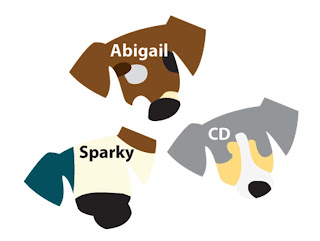
So for this project we had to think of a way to properly display two types of information in a visually communicating way. One of the information types has to be from a personal experience. So I chose to do information over the life span of my dogs based on the color of their coat (fur) and several other factors as well. These are a couple of examples of what some of the visuals might look like, these are just some of the starting stages of the puppies, this visual kind of hits two birds with one stone by including both the name of the dog and the coloring/markings on the dog.


Subscribe to:
Posts (Atom)

